|
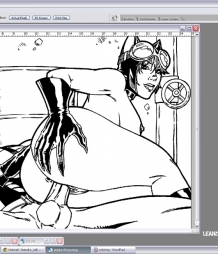
Hey, guys! Last time I took you through the process of creating the drawings for the website. This time, I'm going to show you how I color these suckers up! First of all, the tool of the trade, like last time. I use Photoshop to color my artwork. The version I'm running is CS2. Photoshop is currently on version CS 5, but there's a learning curve associated with each new release and they always move shortcuts around. it's very annoying! CS2 does the job fine for me, and I'm a big fan of "if it ain't broken, don't fix it!" Coloring things with software if made possible with the use of digitizing tablets, which are nifty little touch-sensitive pads that come with a special pen. They work like a mouse, but it feels like using a pen, plus, it captures all the nuances of your hand, such as pressure and sometimes even angle. The main authority in tablets is Wacom. You really can't go wrong with their products. I use a Wacom Graphire 4 (Fig. 1), which isn't even one of the most sofisticated products they have out there. To me, that's fine. It does what I want it to do. It all starts with the complete black & white drawing, with all the blacks filled up (which, if you can remember, I use Photoshop to do). What I have to do next is get the lines on their own layer, so that I can color underneath the art without affecting it. You can think of it as if the drawing was done on a transparent sheet of plastic, and now I'll be coloring a white sheet of paper beneath it. Photoshop is the perfect tool to get the job done, although I know of some artists who use Corel Painter instead. They do similar things. I'm just used to Photoshop, so I use that. This first part is now an automatic process. I have a series of scripts assigned to my function keys (F2, F3, and F4) that copy the artwork from the black channel on the file, paste it on a new layer, and create a separate layer beneath it for me to add the colors on. Since this is a process that I would have to repeat for every drawing, it's faster to leave that part automated. My Layers palette looks like what you see in Fig. 2. The next thing to do is to choose the colors, of course! If a character has already shown up at Leandro Comics, I have customized color swatches for him/her (Fig. 3). If not, I build one as I go along. Usually, any given part of the character (skin, costume, gloves, boots, etc.) gets three colors, at least (Fig. 4). That's because things exist in three dimensions, so I have to simulate the “roundness” of objects by adding areas of light and shadow. On the earlier drawings in this website, I used only two colors to accomplish that. As I progressed, I realized certain things looked better with three colors. Skin is one of those things. Most of the time, you might not even realize there are three or more colors in there, but there are! So, here comes the coloring. There are many methods of coloring comics. The one that's used the most is called cuts. With cuts, a colorist lays down a base color and then creates all the areas of light and shade by making smaller selections (or cuts) inside that base color and filling it up with different colors. This method of coloring ensures a greater degree of consistency in style when many colorists are working in one book (which happens all the time, because this industry is all about tight deadlines!). Now, I'm a one man army! I draw and color all the art you see by my lonesome, so I don't have to worry about consistency. So, I don't use cuts all that much, except in things like hair and metals. I don't use cuts a lot because I'm not very good at it (nobody's perfect, right guys!), and because I find it too slow for the pace I have to move at in order to get you guys some fresh updates. Here's how I do it: Say I'm starting to color a picture on someone's skin (which I do most of the time). I'll create a selection that closely follows a particular muscle or muscle group within a character's body (Fig. 5). If it's a male arm, I'll usually make a selection for every muscle, like the biceps, triceps, all different sections of the deltoids, etc. Female bodies have less muscle definition, so I'll usually just get the shoulder and upper part of the arm, then I'll get the forearm, etc. Women take a little less time to color this way, as you can imagine. After the selection is made, I use the gradient tool to block out where my light and dark areas are going to fall. Now, the gradient tool is not very intelligent. What you end up getting is usually a straight line of some color that does not follow the contours of the body (Fig. 6). This is when the “artistic” part kicks in! I whip out a soft round airbrush and start to build the lights and shades until I get something that better resembles a 3D body part (Fig. 7). This may take only a few second, or it might take a couple of minutes to get right, depending on how complex a form I'm working on (or how early or late it is in the day). I follow this procedure until I have the entire area colored (Fig. 8). I'll usually get everything that has the same color down in that layer before I move on. This method works for me but, as you can see, it leaves behind some seams between all those areas that were colored with different selections. Now, I know of many artists who get rid of seams by coloring over them painstakingly. I'm not one of them! I get rid of the seams by creating a soft selection around them (it's a selection that's been feathered, or softened, by 6 pixels) and using a Gausian blur filter (Fig. 9). There, all done! When I finish up one area, I flatten that into the background layer, because I don't need to mess with it anymore. Then, I create a new layer on top of that and repeat the whole thing. After I have all the characters all colored up, I move on to the background, which is almost invariably the last thing I color (Fig. 10). The procedure to color the background is the same as before. However, sometimes there are materials that would benefit from a little added texture. If I'm coloring a wall, I always find it better to add in some concrete texture or something. Wood is another material that I like to use textures on. To do this, I'll open up a file from my texture library (these are jpeg files I collect from a bunch of places online) and copy it to the clipboard. Next, I'll color my background selection with whatever color the material is (Fig. 11). Then, I'll paste the texture into the selection. It will automatically go into a different layer, with a mask that only allows you to see it inside the selection (Fig. 12). I'll change the Blending Mode on the layers palette (usually to Overlay or Soft Light), adjust the opacity and voila! Brand spanking "new" busted wall (Fig. 13). When I´m done with all of that, I'm left with a layer with all the colors and a layer with the artwork. The last step is to flatten those two together and re-size the image to make it “standard Leandro Comics dimension”. Lastly, just paste the Leandro comics logo into one of the corners, and it's all done (Fig. 14). The whole thing takes me anywhere from three hours to... Well, more hours than I care to count! I hope you guys enjoyed learning a little about the coloring process. It's a long and laborious process, but it's what a guy has to do in order to bring you the wonderfully exciting stuff you have all been used to seeing here! Now, I admit there are many guys out there who do this a lot faster and better than me. Maybe I'll convince one of them to join in and give a helping hand in the future! So long and see you next time!
|


